Brand your Twitter Account
If you haven’t had enough fun with Twitter yet — or even if you have and are truly enjoying your new “toy” — then today’s Getting Started lesson will help you individualize your site with information and creativity.
Many online sources offer free Twitter backgrounds, and you can try Google for a host of suggestions. OR you can simply link to mytweetspace.com and practice with the site I used for my own account.
After getting midway through this post, I realized that there are LOTS of steps and LOTS of screens. So I decided to begin by letting you know what’s in store. [This reminds me of when my spin instructor tells us about the hills we are going to climb in advance. No one pays much attention, but we do realize that we’re in for a work-out.]
So here’s your work-out:
- Link to MyTweetSpace.com
- Click on Get Started.
- The login screen that follows will instruct you to Create an Account [since you don’t already have one].
- So you Create the Account and click on submit.
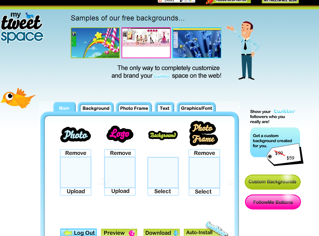
- VOILA: Now we get going. You are on the MAIN screen. Begin my uploading a photo.
- Next, if you have a LOGO, you can upload it. If no logo, then move on.
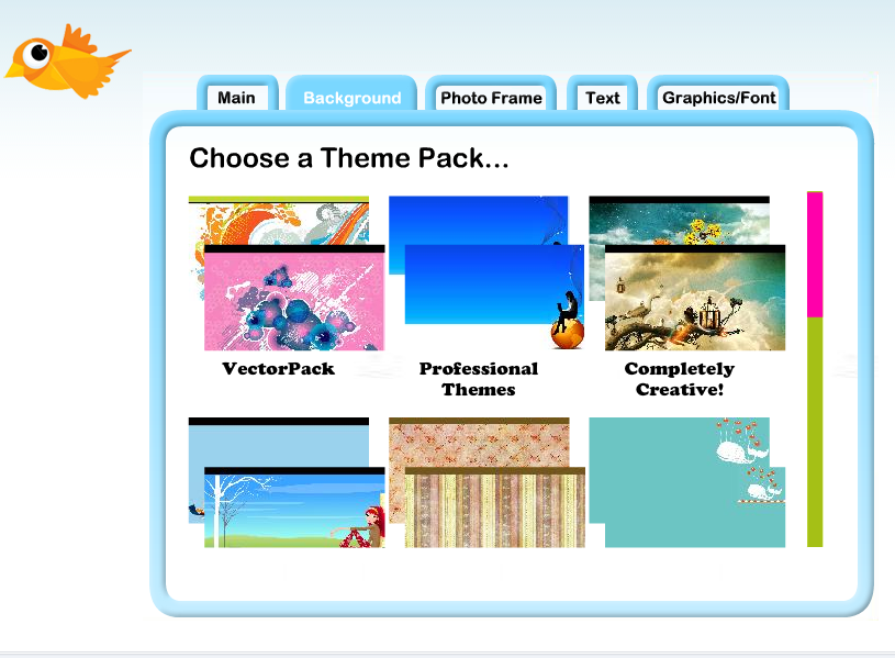
- This is FUN. Find a background by selecting the Background Tab. This may take a while as there are NINE different categories to choose fun. Remember have fun, but do consider how the color and design will affect your brand.
- The third tab allows a frame for your photo.
- The fourth tab, marked Text, allows you to ADD a number of contact names, numbers, and URLs.
- The last tab is Graphics/Font where you can customize Text and Colors.
- Go back to the Main tab where you can PREVIEW and then AUTO-INSTALL.
- You now have a bright, new personalized background.
Let’s get started
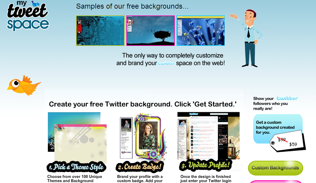
1) Go to MyTweetspace.com
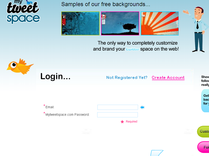
This is the opening screen:
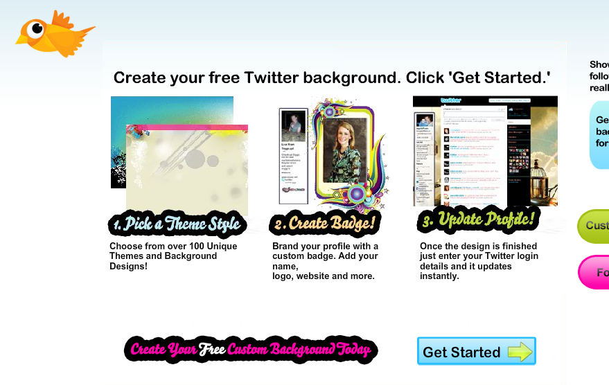
2) Here’s the bottom half of that screen that shows where you CLICK to “Get Started” on the bottom right:
On the next LOGIN screen, you will need to CREATE your account:
3) Click “Create Account” Below
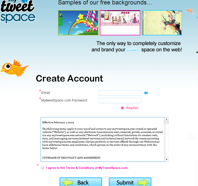
(4) Second box on right: FILL IN THE BLANKS: (a) your email address, (b) any password you’d like, (C) check the box to approve terms.
CLICK “Submit” and VOILA:
5) Upload your Photo
6) Next, if you have a LOGO, you can upload it. If no logo, then move on.
7) Find a background by selecting the Background Tab. This may take a while as there are NINE different categories to choose fun. Remember have fun, but do consider how the color and design will affect your brand.
8 – The Photo Frame tab offers a frame for your photo.
9) The fourth tab — marked Text — allows you to ADD a number of contact names, numbers, and URLs.
10) The last tab is Graphics/Font where you can customize Text and Colors.
11) Go back to the Main tab where you can PREVIEW and then AUTO-INSTALL at the bottom right.
12) You now have a bright, new personalized background.
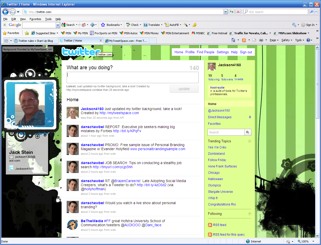
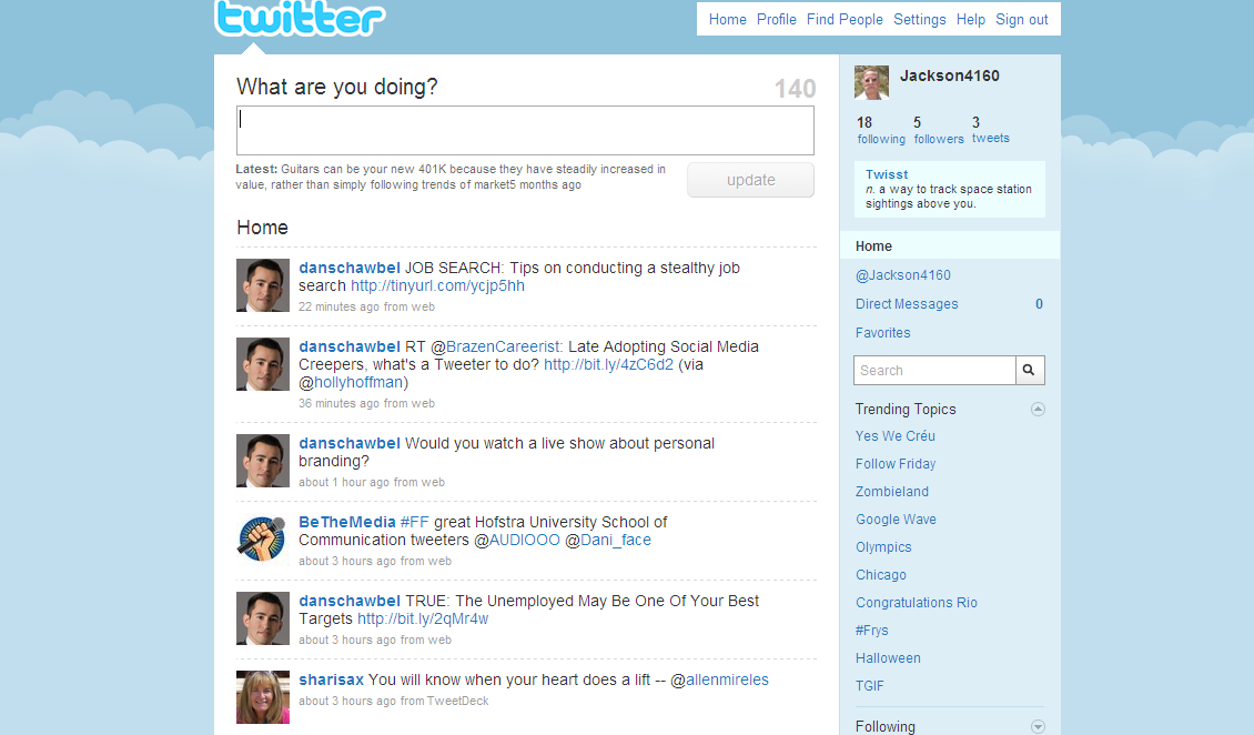
BEFORE
Here was my husband Jack’s Twitter account before “MyTweetSpace”
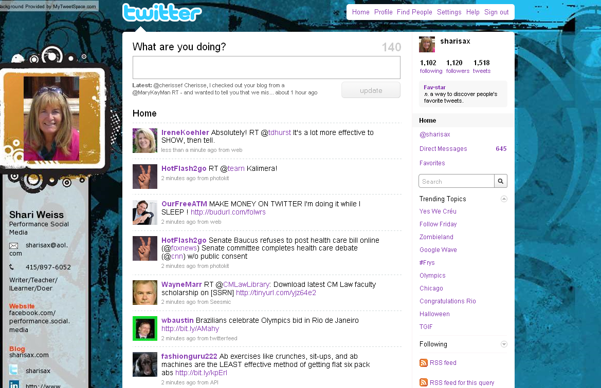
AFTER
Here is the NEW and IMPROVED Twitter site
A piece of cake, right? Let me know. Let us all know.
Please add your own experiences with other Twitter Background sites, and have that FUN while you’re at it!
* * *
Just found site to add Twitter Follow button:


I personally love that you can personalize your Twitter backgrounds. Although I think “MyTweetSpace” is a great site, I chose to use two things on my twitter background that I love; My favorite colors, and a photo of my grandmother and her brother from the early 1930’s. It’s one of my all time favorite photo’s and had originally thought to use it as my album cover. I can’t imagine a more personalized Twitter background for myself. Hope you all like it as well.
Billy, we will all be checking it out next week. Good going!
I had no idea there were this many options. I see a pretty new twitter page in my future!
I think everyone knows how to make a background
Perhaps in your generation, Eduardo . . . but in mine — I wouldn’t be so sure 🙂
Wow, I didn’t think you could do all this on twitter . You keep teaching me something new, Like they say ….. “you learn something new everyday”
The hope is that this NEW LEARNING will be fun and of value
Thanks for sharing this tutorial with us. My Twitter page is better now: twitter.com/mnguyen00
hanks for sharing this. Your direction is so easy to understand and I just follow all the steps. Visit my new site: http://twitter.com/buiphannghia
I thought creating a background for the website would be hard, but mytweetspace is really easy to use. It helped me to create the screen and information of my twitter in 10 mintues. It is a good website!
(YuetTse1 is my twitter name )
It was very helpful. The instructions are very simple to follow. I like the fact it was simple.
http://twitter.com/MMaurice12
The site is not complicated at all. It reminds me of all of those sites for myspace like “Pimp my Profile.” There will probably be ten more sites like this with cool codes for twitter five months from now. I think sites like this are great beacause it gives people a chance to show their individual style in their profiles.
http://twitter.com/ReniBabi
The graphic artwork that was available for our backgrounds was magnificent! Each one revealed different things though every one was beautiful. Thanks for showing us how to customize. Check out my new background: twitter.com/berneytee3
My Twitter page is Designed! And it looks awesome.
Before I designed my page, twitter seemed to be a boring site, but now after I designed it, I feel like I want to visit my Twitter every day because it gave me an inviting environment, and when I look at my designed page it reminds of something familiar to me that happened several years ago.
So i think the designing part is a pretty cool thing the twitter have provided for users, because you can be as creative as you want and design you page in whatever way you want it to be.
Visit me at twitter.com/misgunzee
with just few simple step, you can get a really attractive background. It’s so cool !!! I like it http://twitter.com/lucie1507
I didn’t use Mytweetspace.com to personalize my twitter page. I went to twitter.com and setting. On there it has steps to go by, like how you listed yours on your blog. So step by step I did changes to my page. Here’s my twitter http://twitter.com/omgjuicyk
The tutorial was very helpful for me. It’s really hard for me to find the right background.But with a tutorial for a twitter background is so much easier and it doesn’t take too much time. The steps were very clear and easy to follow.Thank you and please view my page.
this was very helpful to me. thank you very much. now my twitter profile looks great. I really didnt know how to decorate my page. but thank u.
My new site: http://www.twitter.com/LUPAYY
Very easy instructions. mytweetspace.com is so simple and easy to use!
It’s great that you are blogging about how to create your twitter page.
It will help you learn about that person. The color they like. Show off there pictures and personality. And I believe it will make them feel like their more at home. That will give them a little more attitude about their page.
When I first created my twitter page it was a piece a cake because I have a myspace page and I have had a website before so I was pretty much was familiar with the steps.
But going back to just learning was kind of hard. I would see other friends with nice pages and different little smile faces and hot colors and then I saw pictures as backgrounds and music on their pages and voiceovers. So I thought I need to upgrade and this will be great for networking and better than having a website paying tons of money for.
The steps that I used included my own personal picture because I do modeling and acting, and my face is always the marketing that people are looking for and then my body.
So I just chose a picture as my background. I had to save the photo to my computer. Then to create a background and pick the color i wanted, I had to drag the picture from my computer to my page. I had my backgroud less then 5 mins; it was fun and it made my page feel like it was pretty.
This is a great tutorial. Also, in addition to using free software, you can also Google tutorials that show you how to truly customize your Twitter background using Photoshop.
Thanks, I’ll definitely check out the Google tutorials AND invite readers to do the same and share their results. Thanks for the suggestion.
You know, for the first time I’m realizing that the Twitter site is made to appear on a wide computer screen.
These pages appear “squeezed” on older monitors and info on the sides is partially hidden from view by the update column. I never understood that until I saw your screenshots here.
It’s AMAZING how much we continue to learn! I realized HOW EASY it was to do “screen shots” by simply using the PRINT SCREEN key and copying to Microsoft paint. This post was a lot of work to put together, but I think it will be VERY useful for anyone who is just getting started with Twitter and developing their personal/company online brand.