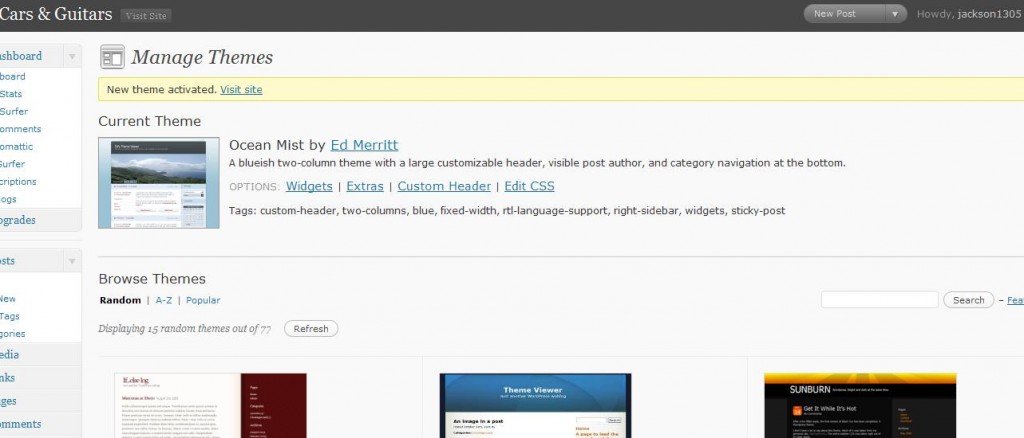
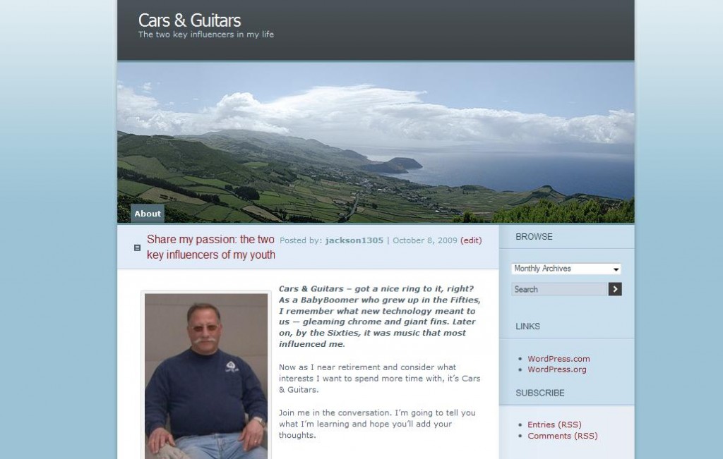
 Many of my blogging students leave a workshop with all the confidence in the world, i.e., they’ve got a Blog Name and a new theme, and we’ve even put up one post with a photo.
But then they get home . . . and what do they do next?
NOW they can come “here.”
What you’ll learn below:
- What the initial Dashboard looks like
- What an Edit screen looks like
- Where to type on the screen
- How to Bold, italicize, underline, etc.
- How to Save Draft, Preview it before it goes “live,” and then How to Publish it so it is “live”
- Brief description of TAGS and CATEGORIES
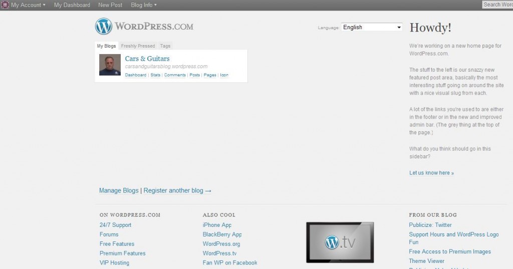
Dealing with your WordPress Dashboard
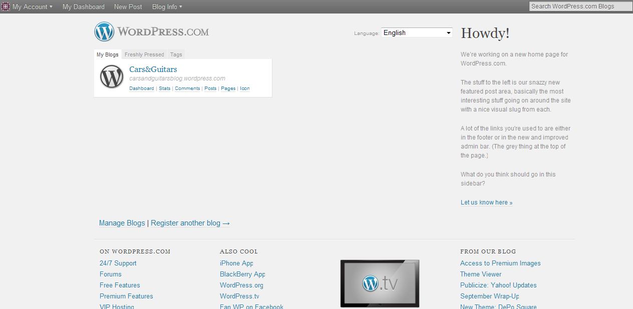
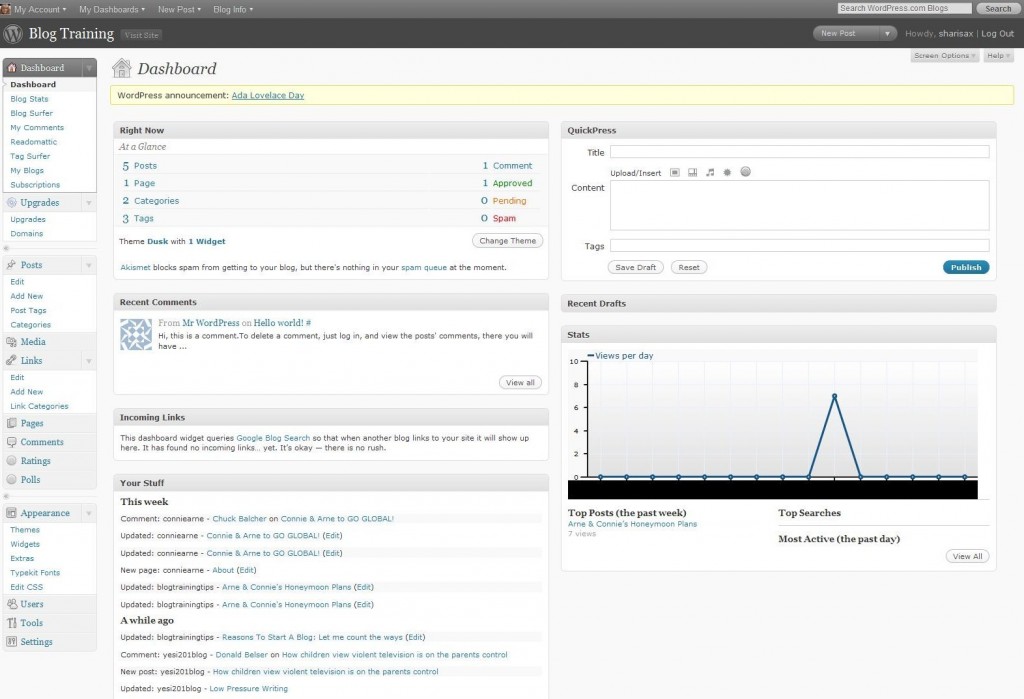
(1) Here is the Dashboard screen that may be somewhat daunting at first [or second or third] glance:
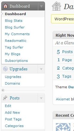 (2) Take a look at the left side of the Dashboard and drop down to the section titled Posts:
Look at the four options: Edit, Add New, Post Tags, Categories
— a — As you might expect, you will Click on “Add New” to start your first post.
— b — For your information, you will be using the “Edit” to make changes on any post once it has been saved — whether it is still in “draft” form or after it has been “published.”
— c –“Post Tags” and “Categories” are not really necessary because you can access these features as you Edit a post.
Now click on “Add New”
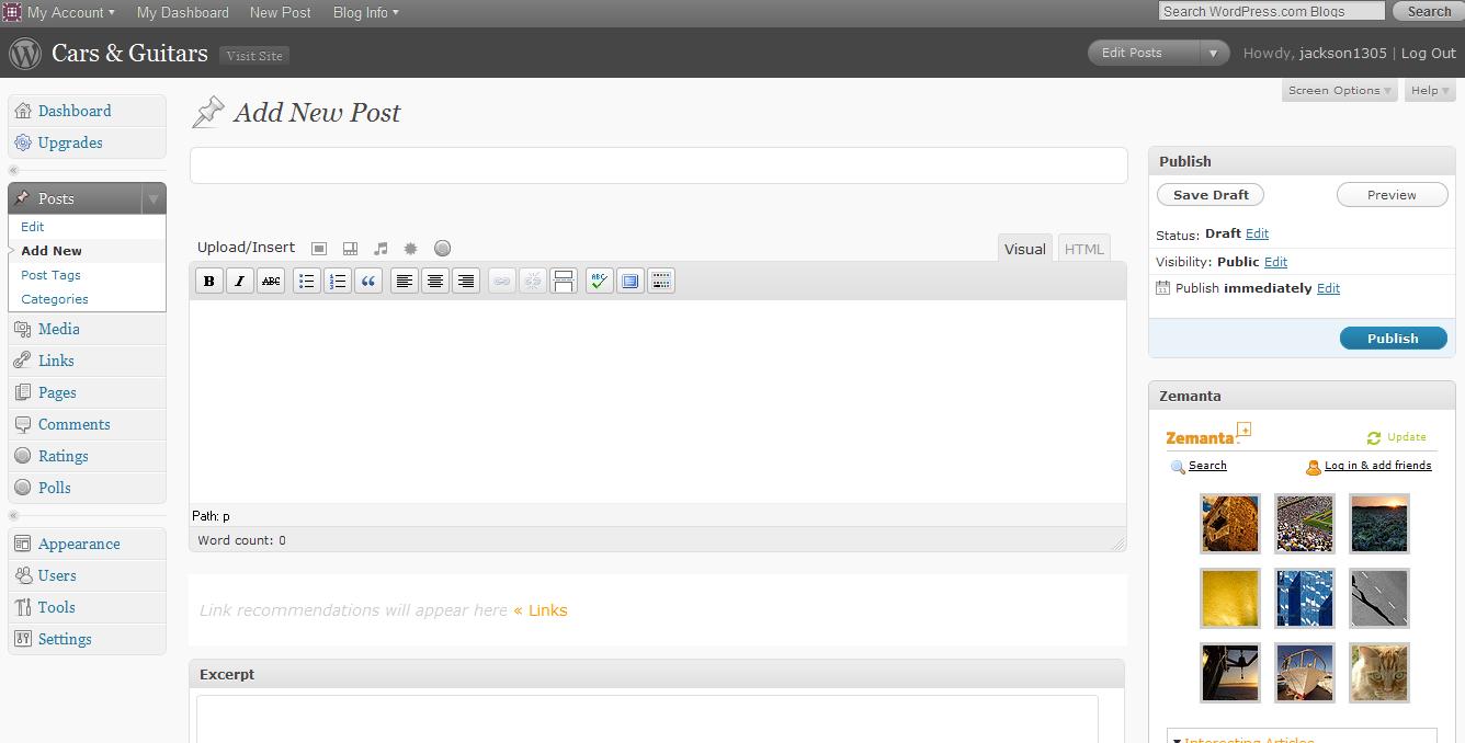
(3) Here is the screen you will use to write your article:
— a — Write a title. Any title will do for now, but keep in mind that your TITLE is of critical importance. So before you actually publish the article, do give the title a lot of thought.
— b — Drop down to the Text Box
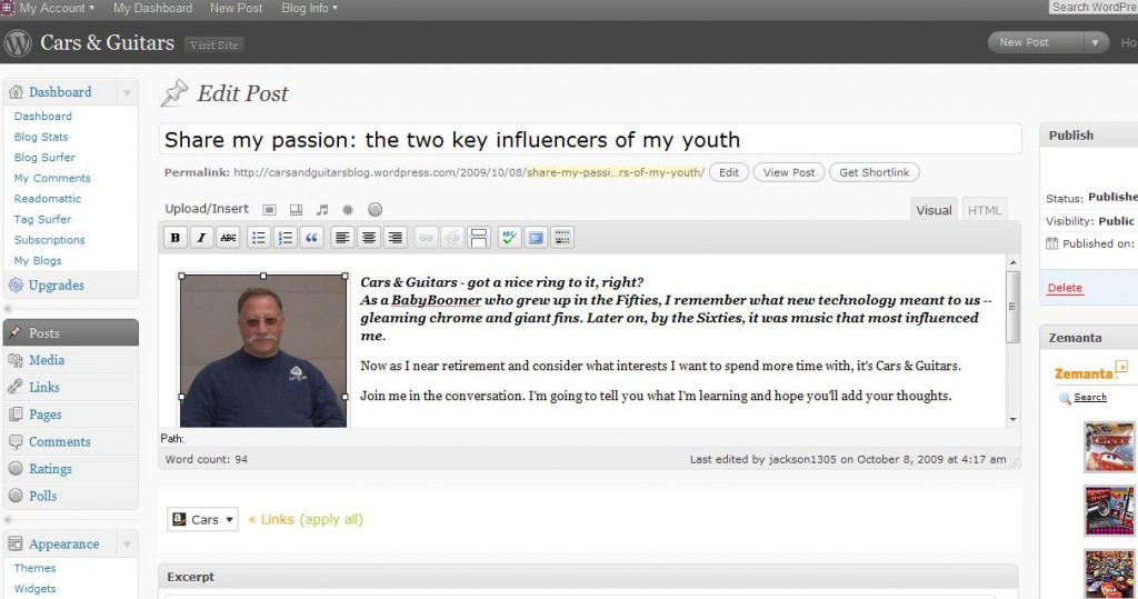
(4) Here is what you could see:
Note TWO differences between the two screens in addition to the Title words and Text words.
— a — Look at the right hand top corner of the text box. You will see the word “Visual” is highlighted. If you check the blank text box above, you will see that the top right hand corner shows HTML is highlighted.
NOTE: Unless you are an HTML expert, you will want to create your posts in the “Visual” mode.
— b — Look at the left hand top corner of the text box. You will see the words “Upload/Insert” and five icons. Immediately below are two rows of icons beginning with the capital letter B [for Bold].
NOTE: The last box in the first row is called the “Kitchen Sink.” If you ever just see one row, then click this button, and the second row will appear.
(5) The Visual Editor allows you to make changes in text that you have highlighted.
Here are your options in the first row:
B = Bold; I = italic; ABC =strikethrough [e.g., financial document uses];
The next two boxes allow for a bulleted list and a numbered list.
The “quote mark” is used to indent portions of the text, e.g., for quotes. The style of the quote may be quite different, depending on the theme you have chosen. Some themes will put a Large Quote Mark in front of the quote. Other themes will put the quote in a white box.
The next three boxes are for allignment: align left; align center; align right.
The tenth and eleventh boxes [which are NOT highlighted in the screen shot above] are used to link your text to a URL. Once you highlight the text and click on the “link box” you will see a new box open up, and you can write [or paste] a URL.
The twelfth box is for an advance option called “Read More tag”: I wouldn’t worry about this one for now.
Spellcheck should be familiar
The second last box can toggle between a full screen and regular screen.
Finally is the KITCHEN SINK which toggles between one and two rows of Visual Editing tools
Second row options:
The default in the first box is for standard text. The drop down box will allow you to enlarge the text size for Headlines and Subheads. Different themes will treat the Heading 1 and Heading 2 and Heading 3 differently. You should experiment, but the Common Wisdom is that you should not use Heading 1 in the body of your post. Usually your top headline/title is Heading 1.
U =underline; the next box is Full Alignment
The fourth box offers different colors for your text.
Ignore the fifth, sixth, and seventh boxes for now. They are used when posting from other sources.
The horseshoe-looking icon will offer a drop-down box of Special characters like accents and cent signs.
The next two boxes will help you “un-indent” and indent.
Then you will have an opportunity with the arrow curving to the left to “undo” or the arrow curving to the right for a “redo”
Finally, the question mark will open up a help section for the Visual Editor.
 (6) Save Draft — Preview — Publish
— a — As when writing with any wordprocessing program, you may want to save your work often.
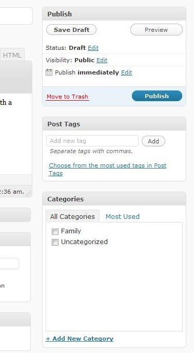
You can see the “Save Draft” button. Press it whenever you’d like. Then you need to wait for the page to reload in the saved version.
— b — Next to the Save Draft is the “Preview” button. If you press this button, you can see what your post will look like when it is published, BUT it will not be published until . . .
— c — You press the “Publish” button. Once you do publish, then, you will see the word “Update” instead of Publish.
(7) Tags:
Tags are the KEYWORDS that will provide your article with SEO, i.e., Search Engine Optimization.
Common wisdom these days is to choose phrases, rather than single words. As the instructions tell you, put a comma in between each phrase. Then press “Add” . . . and, of course, Save Draft again.
(8) Categories:
In the beginning, many people confuse tags and categories — I know I did.
Here is one way to think about categories: What are your “Ultimate Concerns”? What do you really want to talk about in your blog?
My suggestion — which I have learned and have not yet heeded in my own blog — is to stick with ONLY five or six categories. This will be the easiest way to organize your articles for your readers, and you as well. [And I will be limiting my number of categories soon.]
NOTE: You will be given one category “Uncategorized.” The one you see that says “Family” was added by clicking on the link that says “Add New Category.” [To DELETE a category, you will need to go to the Drop Down box underneath the word Categories in the POST options where we first began.]
Some final words BEFORE this article turns into an eBook:
If you’d like to know how to insert a photo or a video [and don’t want to figure it out for yourself], then please leave a comment with your question, and either I will answer or another reader will help.




 HAVE FUN!!