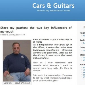
Way back when . . . I first started blogging with WordPress.com in April of this year, I never changed my background from the Kubrick default theme. So for four months, my blog looked exactly like my husband Jack’s above.
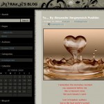
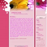
HOWEVER, now that I know how EASY and how much FUN it is to see a more distinctive looking page, I wanted to help you beautiful your blogs as well. Take a look below at several of the student blogs created in ONE HOUR during class using these instructions and then STEP TWO: Choosing the Theme [or background].
You can click on any of the images below to get a closer look at the blogs. Below you’ll find directions how you can spice up your own Online Persona.




HERE ARE YOUR INSTRUCTIONS
1. Sign into WordPress.com. [If you have not yet registered, then you’ll need to start with the previous post.]
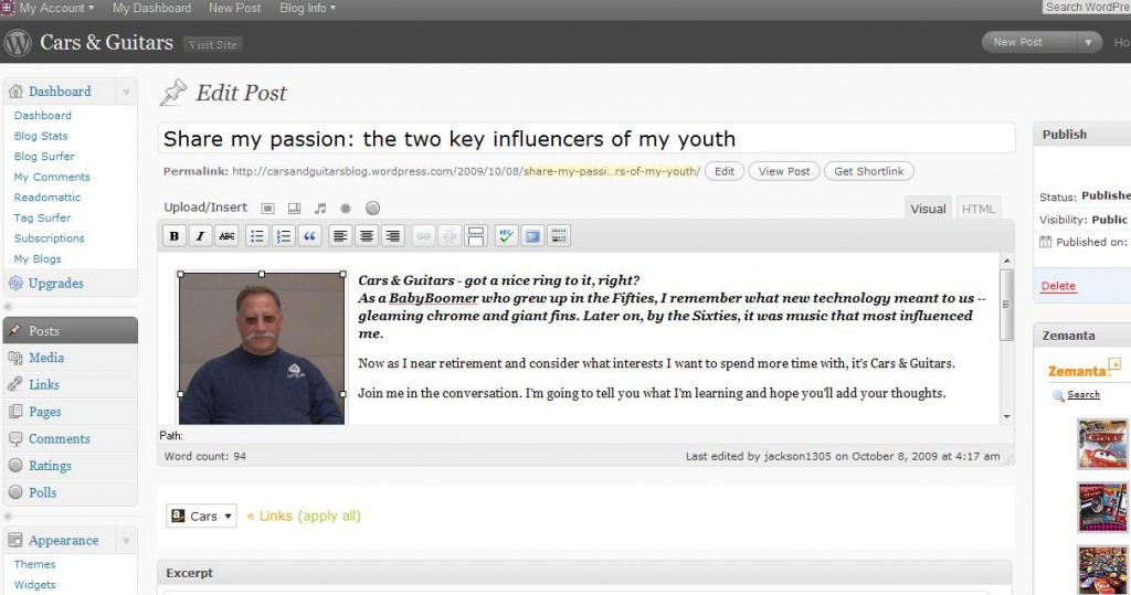
2. The screen that pops up is the portal to your dashboard, i.e. where you make ALL the changes and additions to your blog. Here is Jack’s portal:
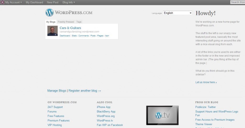
3. Click on the word DASHBOARD [beneath the title and to the lower right of the photo icon]. And the screen below appears:
4. On the left of this screen is a sidebar filled with great categories to explore, but for now Scroll Down to the word APPEARANCE. A little arrow brings a drop down box. Click on the word Themes. This brings the screen shown below where you will find 77 fancy free designs for your blog.
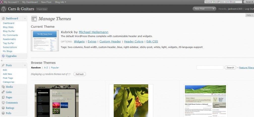
5. This step may take some time.
- You can use the “Random” search,
- an alphabetical listing of blog titles [which may only be helpful if you already KNOW the title of a blog design,
- or do what post people do, select the “Popular” category.
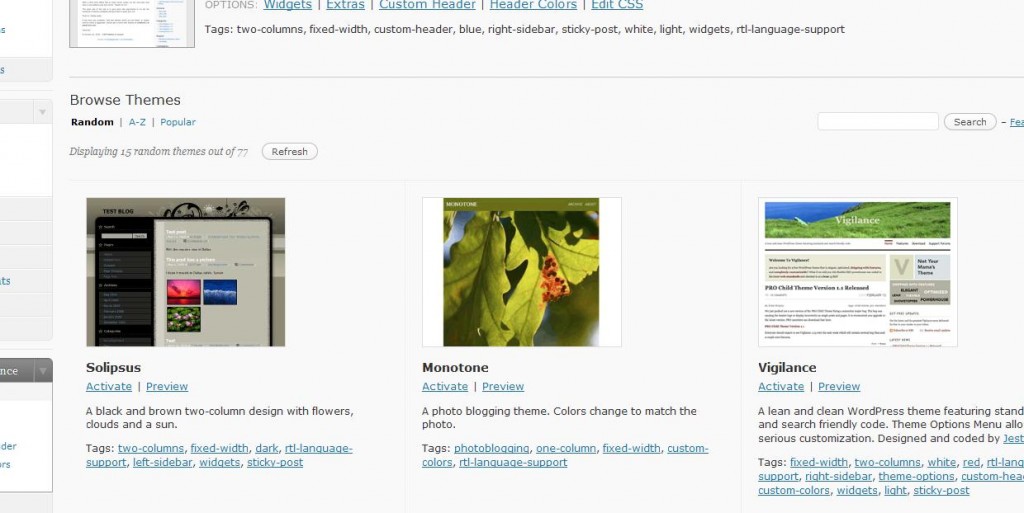
When you see an icon that “talks to you,” click on the Kubrick theme or check out an entirely new theme. Below you can see the part of the Manage Theme screen with the “Preview” option below each thumbnail:
 HAVE FUN!!
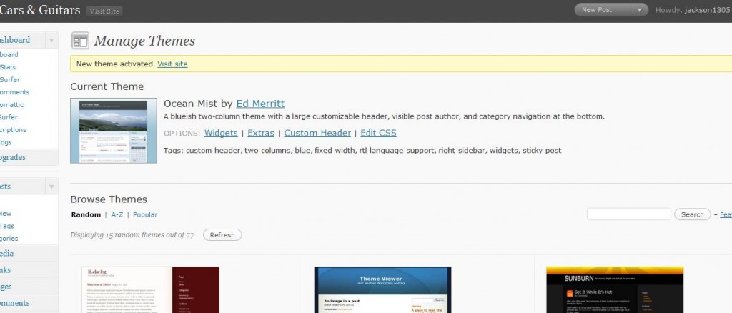
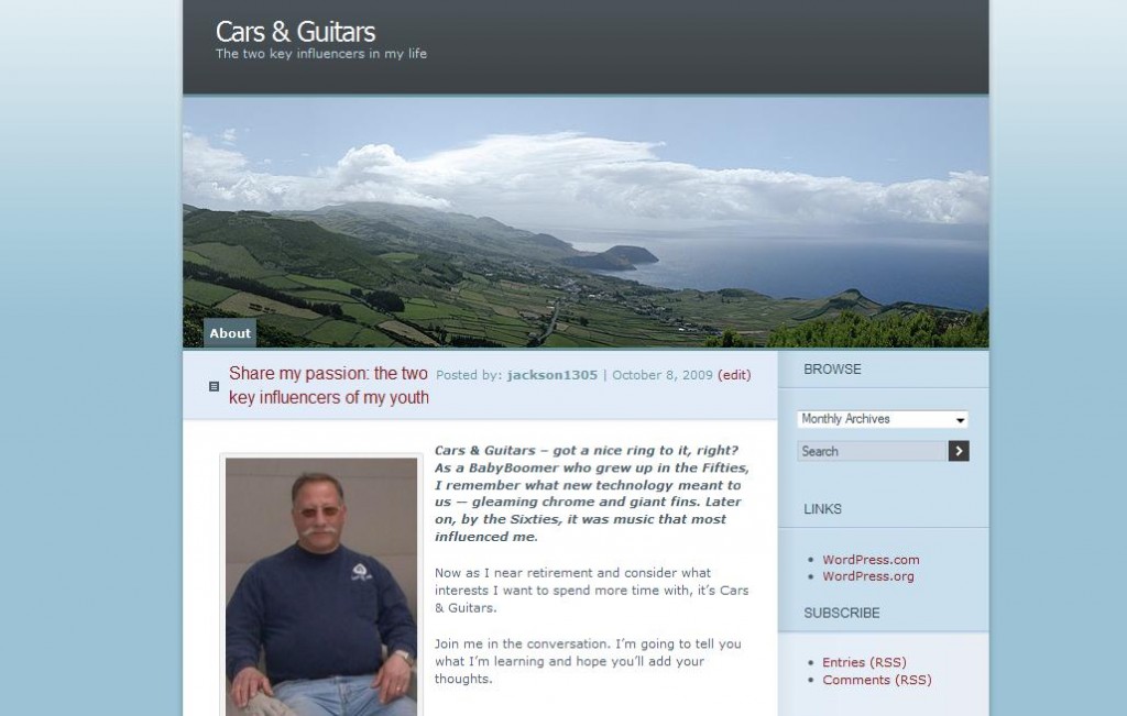
6. Here’s the one I picked for Jack ALTHOUGH he’ll probably change it later 🙂
I chose Ocean Mist because Jack likes Blue, and there is a Header Photo, which Jack can customize. Here is the way his Dashboard Manage Theme page looks now:
7. When you click on the “View Site” link on the top banner next to your Blog Title, you will get your new design. Here is Jack’s:
That’s all . . . for blogging Lesson Two.
In the future we will look at topics like (a) what to blog about, (b) what to put in your sidebar, and (c) features on your dashboard.
Of course you can already find tons of information on these topics all over the Web AND you can read WordPress.com Documents AND you can ask questions on the site Forums.
Lots of information is out there BUT here’s a caution: DON’T JUST READ . . . JUST “DO IT”

I thought I did put this comment on your latest post.
It seems if I I am in full screen mode – the image does not go where I want it. If I am in the regular edit mode and the cursor is in the right place, it works.
I wish WordPress were as simple as other programs.
Images are important. In speaking, visual aids improve retention. I am sure it is the same in writing.
Sorry, Ethan,
(1) you are still in the “older” post
🙁
(2) I am glad that it works, though
🙂
(3) you will no doubt find that for more functionality, you will need platforms that are a bit more complex.
Hi again. Helpful article. I am enjoying reading your stuff.
I have a question perhaps you will help me with – I can not figure out how to place a picture where I want it in wordpress. I can move it right, left or center but not up and down in the blog.
Feel like sharing?
Sharing is good
🙂
If you know how to use the PHOTO icon in the row that starts with Insert, that is half the battle.
But it sounds like you need to be CAREFUL where you put the cursor/mouse
When I center a photo ABOVE the text, then I put the cursor above the text and will sometimes press Enter to skip a line
If you want the photo on the RIGHT or LEFT SIDE of some text, then you put the cursor at the beginning of the line of text.
After you upload the photo, you are asked for instructions: right, left, center, and None
I’m not positive about None, but the rest are clear.
[I really only use “None” when I simply want the HTML text for use in other spaces.]
Hope that helps. If anyone else wants to chime in, please do.
One suggestion, Ethan, if you can place this comment directly on the latest post, we may get other people to respond to your question.
This is Amazing,it’s good way to start blogging.