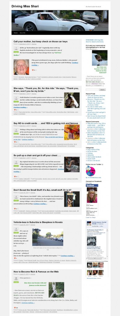
 I’ve decided to use the 2010 default WordPress theme for my new blog DRIVING MISS SHARI. But I wasn’t happy with the Home page: readers had to scroll through the entire recent article to get to the previous one – and so on and so on.
When you come to SHARISAX IS OUT THERE, you see a thumbnail and a brief description with a clickable link to “Read More” for each post. That was simply a handy feature of this blog’s theme.
But how to change the Home page on my new blog?
I’m not a web developer and depend on a few friends to help me with the back end, but I thought I might try to “do it myself” with a little online help:
**First I posed the question in the WordPress.org Forum: No Response
**Then I posted the question on LinkedIn’s Q & A: The two responders convinced me that I’d never figure it out on my own.
**So I went to my wonderful Australian friend James Hilton who is truly my behind-the-scenes genius.
Guess what? It’s really a breeze:
1. After you create each post, you place your cursor in the position where you want to end the description. Then you click on the “Insert More tag (Alt+Shift+T)” which is just to the right of the spell check on the first row of your edit icons. [Looks like a wide thin rectangle above a boxier shape].
2. Then you scroll down the right sidebar, and you will see a menu item that says “Featured Image.” [It is right below “Post Tags”] Click on “Set featured image” and you will get the same menu screen where you insert photos into the post itself. After selecting your image, be certain to click the instruction below the size selection that says “set featured image.”
VOILA! Your thumbnail is set.
PS If you set the “more tag” after a photo in the introduction of the post, you may not want/need a thumbnail.
PPS Check out DRIVING MISS SHARI and leave a comment on my first post to help me reach my goal of 500 comments. THX

Ok So I get what you explained up on top – but it is hard to implement without documentation to what code and where james added.
I’m going to try this right away. I was very unhappy that the 5th blog in my series on project planning and administration was at the top of the home page. With the thumbnails, maybe I can get them to the 1st blog right away. Good post. Thanks to Dave, too. I have the same WordPress TwentyTen theme so I’ll keep his suggestions in mind, as well. c:}
Thank you James for this nifty little trick. I was always of the opinion that the thumbnail along with excerpt has to be a template modification and one has to know php… I was wrong…
It’s great to have both you gentlemen in my corner. Zahid, thanks for your help.
🙂
lol, nice, but I will add that there’s an important little bit of code to add and to change.
By default, the TwentyTen theme puts the featured image in the header. I moved it to your loop and changed the sizes of it in the theme functions file.
I then used CSS to draw a box around each post, decrease the size of the text, and float the thumbnail to the right.
All up, 15 minutes research since its a very confusing theme and 1 minute of coding.
I too, question the usefulness of forums. They are run by arrogant kids who insult you for asking simple questions that they can find the answer to in one search on google. (but ask them to program a search engine and all of them will spend half a day taking a crack at it)
It’s ALWAYS quicker to make friends with a programmer in Australia, send him some Cap’n Crunch in the mail and have all your programming questions answered for free.
James, THX for the clarification. You did make it look SO DARN easy. I hope that “together” we’ve helped others. Are you ready for more Capt’n Crunch?
🙂